- About Ramapo
- Academics
- Admissions & Aid
- Student Life
- Athletics
- Alumni
- Arts & Community
- Quick Links
- Apply
- Visit
- Give
Design Standards
Design Guides & Rules
Color Palette
Beyond our logo, color is the most recognizable aspect of our visual brand identity.
Primary Palette
Using our primary palette appropriately is one of the easiest ways to make sure our materials reflect a cohesive Ramapo College brand.
|
Maroon PANTONE: 202 C |
Maroon 50% Opacity HEX: #72111F |
|
Cool Black PANTONE: 426 C |
Cool Black: 75% Tint HEX: #545658 |
Secondary Palette
Our secondary palette serves to accent our primary colors and should be used sparingly.
|
Red PANTONE: 199 C |
Red 25% Opacity HEX: #A42228** |
|
Warm Gray PANTONE: Warm Gray 1 C |
50% Tint* HEX: #EAE9E5** |
20% Tint* HEX: #F7F7F5** |
|
GOLD PANTONE: 7407 C Only to be used for graphic elements or for text on a dark background. |
Gold 50% Tint* HEX: #DAC094 |
|
DARK GOLD PANTONE: 4026 C Only to be used as 18+pt text or bold text on a white background |
|
Special Occasions ONLY PANTONE: 10128 C |
*Different tints/shades may be used then the versions that are displayed. **Color differs from the PANTONE swatch breakdown for website purposes.
Color Usage
It is important that we consider all people when designing for our community which means that we have to design for those whom may have disabilities such as color blindness. Meeting ADA (American Disability Act) standards is important to our outreach efforts. Here are examples of unacceptable/acceptable ways to use the colors from the color palette. Please contact the office of Marketing and Communications if you have questions about usage.
Designer Tip
If you need assistance to make sure your designs meet accessibility standards, please reference the following websites:
Acceptable
Unacceptable
× There is not enough contrast between the red text and the maroon background, which does not meet accessibility standards for colorblindness. It is acceptable to have graphic elements in red on maroon, but not text. Gold text on a maroon background works better. but note that the gold text must be 18+ pt or bold.
Acceptable

Unacceptable

× There is not enough contrast between the gold colored text and white background to meet ADA standards. This instance you may want to use the darker gold, red, or maroon color.
Acceptable
Unacceptable
× Red text on the cool black background does not meet ADA standards.
Graphic Elements
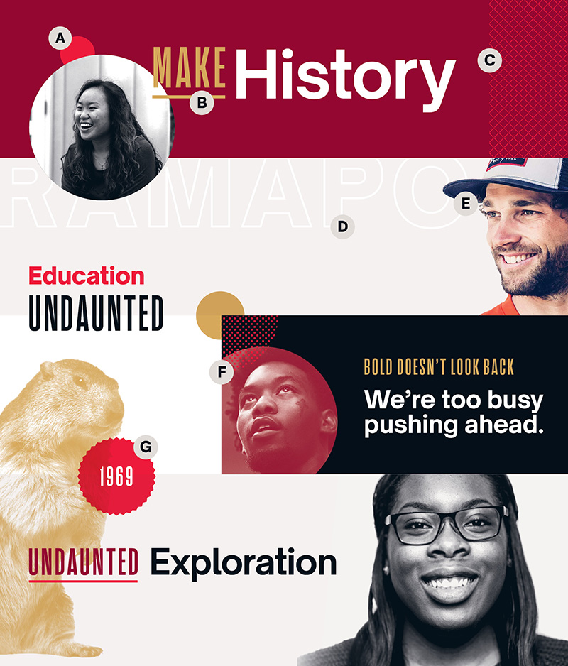
A. Circle Accent / Circle accents are set in any color and multiplied over photos and pattern holding-shapes.
B. Underline / Underline Action Condensed in headlines to add emphasis and visual interest. Thickness should mimic the weight of the type.
C. Cross-Hatch Pattern / Patterns can be set in colors from our palette and placed in a rectangular or (semi-) circular holding shape.
D. Mega-Type / Outline Open Sauce, set in a large type size, and place it breaking the edge of the grid to accent pieces.
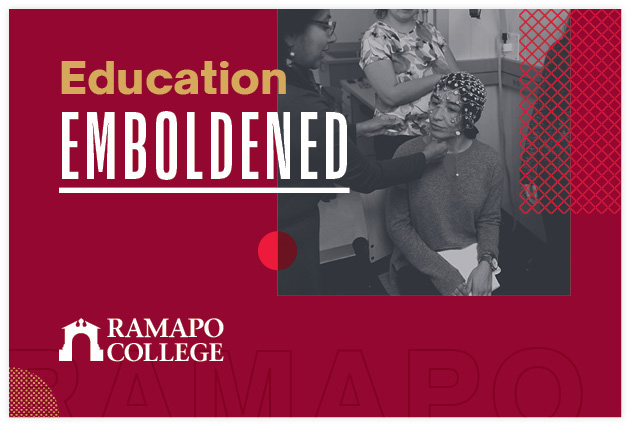
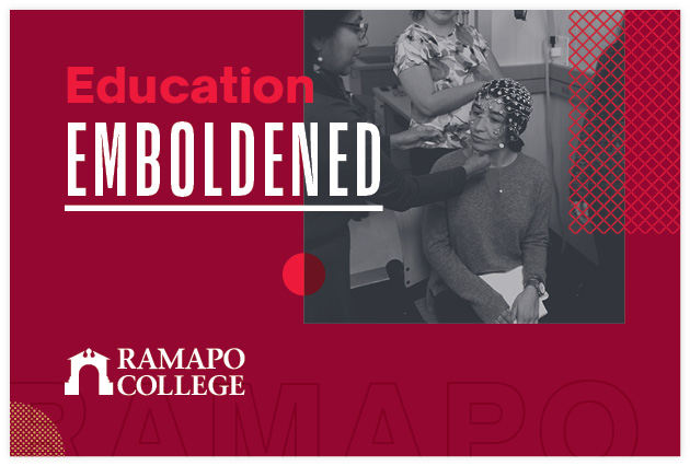
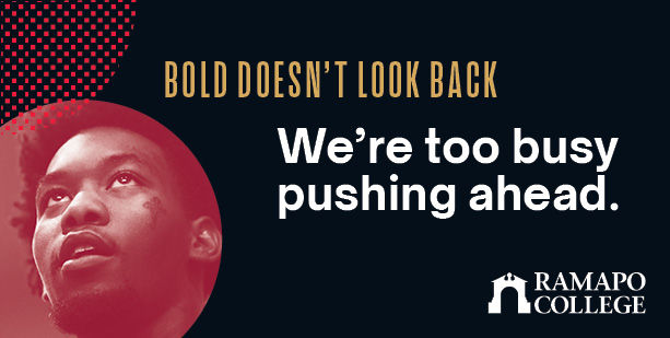
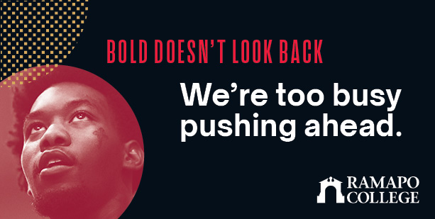
E. Cutouts / Cut out people, places, or things and set them in full-color or duotone for a distinctive way to include photography.
F. Checker Pattern / See “Cross-Hatch Pattern.”
G. Badge / Set in our bright red, these shapes contain short phrases or numbers and are multiplied over photos and pattern holding shapes.
Duotones
Color duotones are an effective way to add color and create a neutral backdrop for text and graphics. We can use a duotone effect on our cutouts, full-bleed images, and photos cropped into a shape.
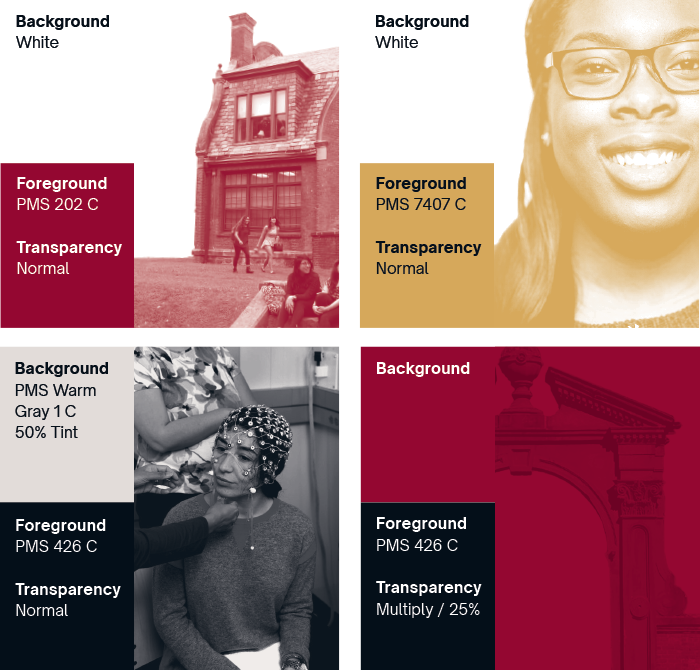
Designer Tip
To make a photograph duotone in InDesign, first open the image in Photoshop. In the top menu, select Image > Mode > Grayscale. Save the image as a TIFF or jpeg, and import into InDesign. Click once on the image to change the background color. Click twice to change the foreground color.
Typography
Just as we choose different words to convey different messages, the typeface we use can have a profound effect on our communications. Consistently using the official fonts selected for Ramapo strengthens and reinforces the brand.
Headers
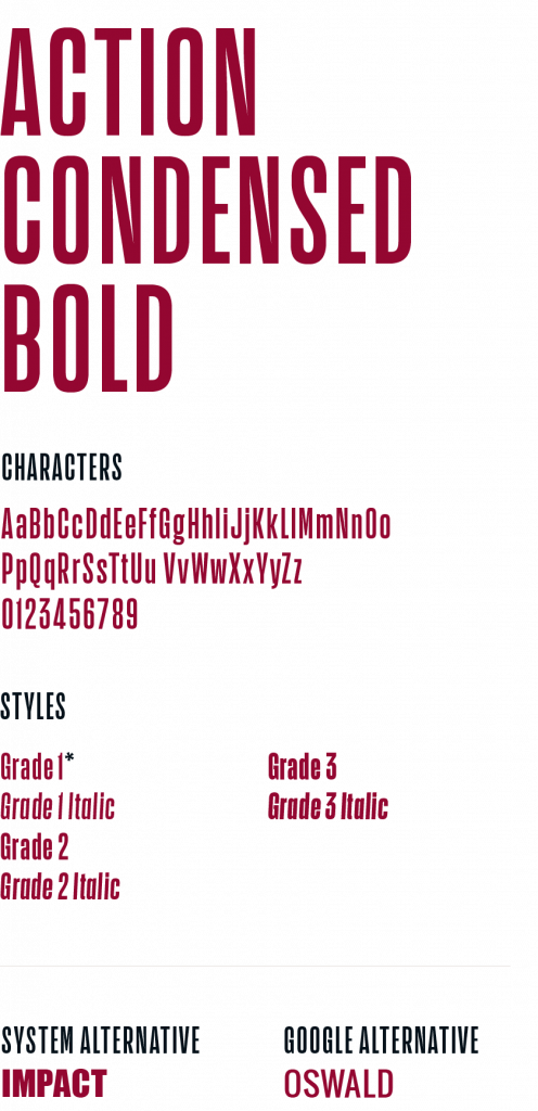
Headers, Subheads, Body Copy
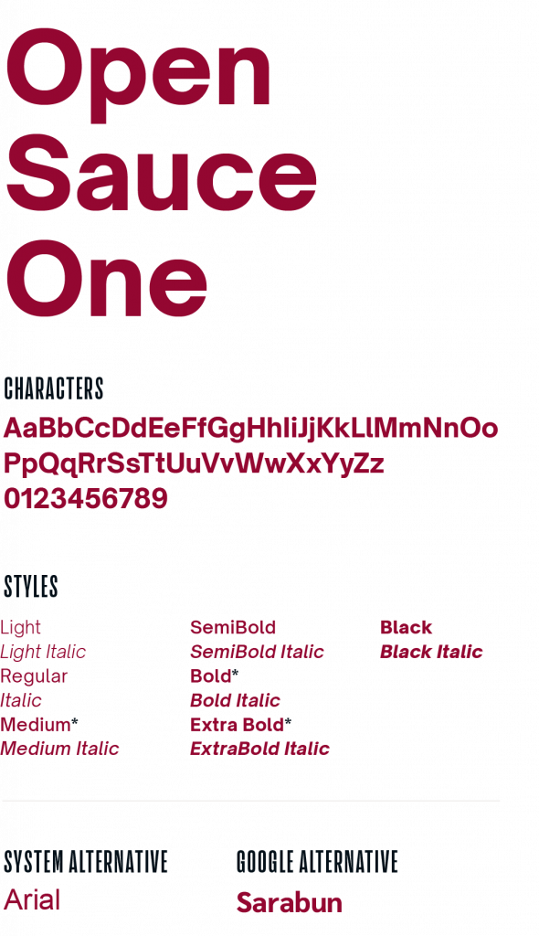
Hierarchy Examples
Follow these best practices when working with Ramapo’s typefaces.

Typography Tips
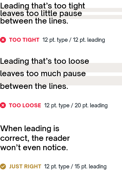
LEADING
Line spacing, called leading, should be set tight,
but not too tight. For body copy, try leading that’s two or three points higher than the type size.
TRACKING
The space between letters is referred to as tracking. As a rule, set tracking slightly looser for captions, and slightly tighter for headlines.
![]()
505 Ramapo Valley Road
Mahwah, NJ 07430
p: 201-684-7500
e: information@ramapo.edu
Copyright ©2026 Ramapo College Of New Jersey | Statements And Policies | Accessibility | Contact Webmaster.