- About Ramapo
- Academics
- Admissions & Aid
- Student Life
- Athletics
- Alumni
- Arts & Community
- Quick Links
- Apply
- Visit
- Give
Web & Digital
As the most sought out resource for information, it is important Ramapo College’s website reflects the College’s brand. Now more than ever, the College’s outreach efforts are performed digitally through digital ad banners and email campaigns/newsletters leading back to the College’s website.
Below, find important information related to major elements of our website and digital media. As the website continues to grow and evolve, this guide may be updated to reflect those changes.
Table of Contents
Website Design Resources
Website Color Use
Please reference the colors below for our website usage. These colors can also be used for quickly reference for digital applications but use may vary. For our official colors for both print and digital use, reference our Design Standards page.
Primary Colors
Maroon
HEX: #862633
RGB: 134 / 38 / 51
Use: Navigation, links
Cool Black
HEX: #25282A
RGB: 37 / 40 / 42
Use: footers, header text
Secondary Colors
Cool Black (75%)
HEX: #313436
RGB: 49 / 52 / 54
Use: body text
Red
HEX: #C41E1E
RGB: 196 / 30 / 39
Use: buttons, links
Dark Red
HEX: #A42228
RGB: 164 / 34 / 40
Use: button hover
Dark Maroon
HEX: #711421
RGB: 215 / 210 / 203
Use: background, accents
Warm Gray
HEX: #D7D2CB
RGB: 215 / 210 / 203
Use: lines, rules, accents, backgrounds
Warm Gray (50%)
HEX: #EAE9E5
RGB: 234 / 233 / 229
Use: background
Warm Gray (25%)
HEX: #F3F3F1
RGB: 215 / 210 / 203
Use: slider background, accents
White
HEX: #FFF
RGB: 255 / 255 / 255
Use: background
Gold
HEX: #CBA052
RGB: 203 / 160 / 82
Use: accents, background, 18+pt text on dark background
Dark Gold
HEX: #BC8C3D
RGB: 188 / 140 / 61
Use: accents, 18+pt text on white background
Gold (50%)
HEX: #DAC094
RGB: 218 / 192 / 148
Use: background, text on dark background
Typography
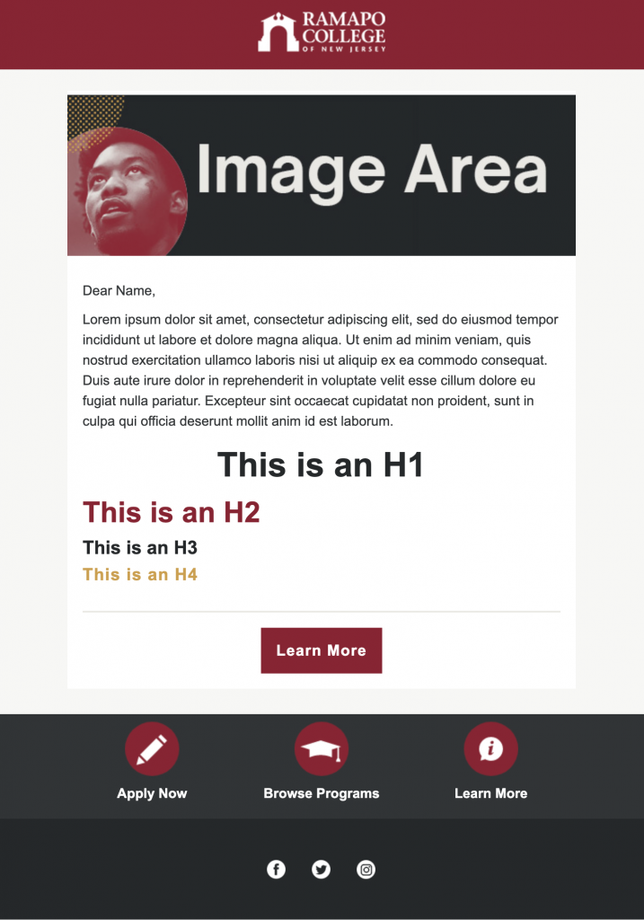
Ramapo.edu uses two font sets – Sarabun and Oswald (which are Google fonts). Oswald is primarily used for headlines, while Sarabun is used for headlines, body content, and calls to action. Arial and Impact may be used on web applications that do not allow the use of Google fonts (example: Mailchimp).
Headers, Body Copy
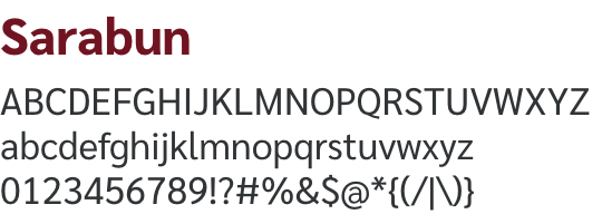
System alternative: Arial
Headers
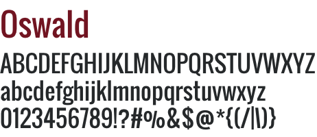
System alternative: Impact
Website Content Page - Style Details
Website Content Page – Content Area
Below is a list of styles primarily used in the Content Page template of the website.
H1 (Page Title)
color: #25282A;
font-family: “Oswald”;
font-size: 50px
font-weight: normal;
line-height: 1.1em;
H3 (Content Heading)
color: #25282A
font-family: “Sarabun”;
font-size: 26px
font-weight: 800 (Extra Bold)
line-height: 35px
H4 (Content Heading 2)
color: #862633;
font-family: “Oswald”;
font-size: 24px;
line-height: 32px;
P (Content)
color: #313436;
font-family: “Sarabun”;
font-size: 17px;
line-height: 26px;
link color: #C41E1E
Website Templates & Grid
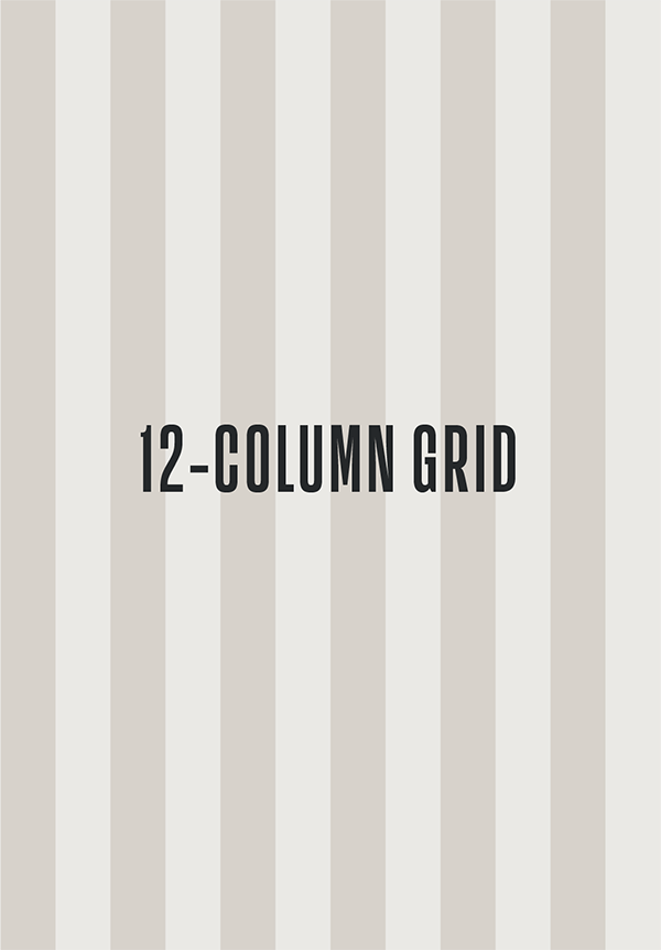
Most of the public website (ramapo.edu) uses 3 main templates, with components working together to create variations. The website uses a 12-column responsive grid to ensure the layout works across all devices.
Homepage
Ramapo.edu uses a single column homepage layout to drive users to key areas of the website. This single column format allows for new rows of content to be added when needed.
Landing Page
Think of landing pages as homepages with more of a focus (ie: an Admissions homepage, Academics homepage, etc). They act as a jumping off point to content pages nested within each section.
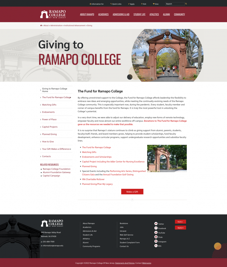
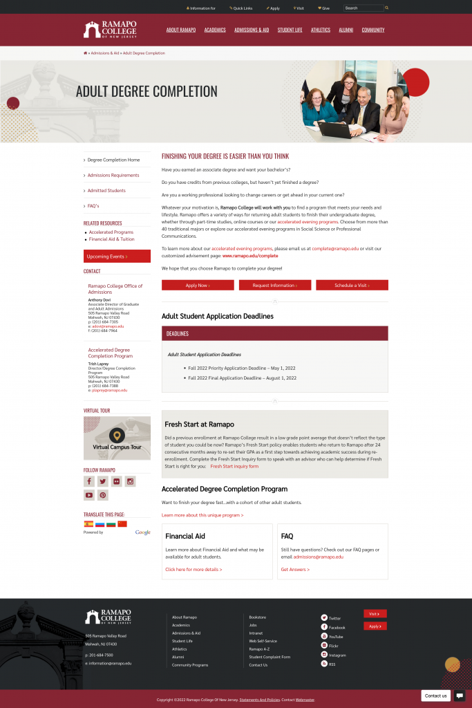
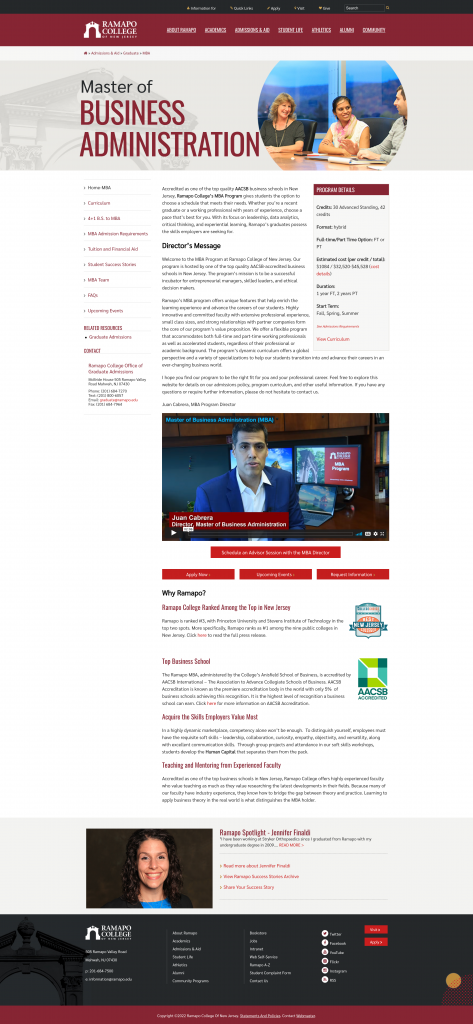
Content Page
The backbone of Ramapo.edu, content pages make up the majority of the site. Components are used to create variations of this template, but the core layout consists of a left navigation column with callouts, and a main content area.
Design Elements
Our website contains many different elements throughout its templates, but the most common and crucial to proper content management are listed below. These elements are primarily used within content page templates, but can be used in landing page or unique templates when necessary.
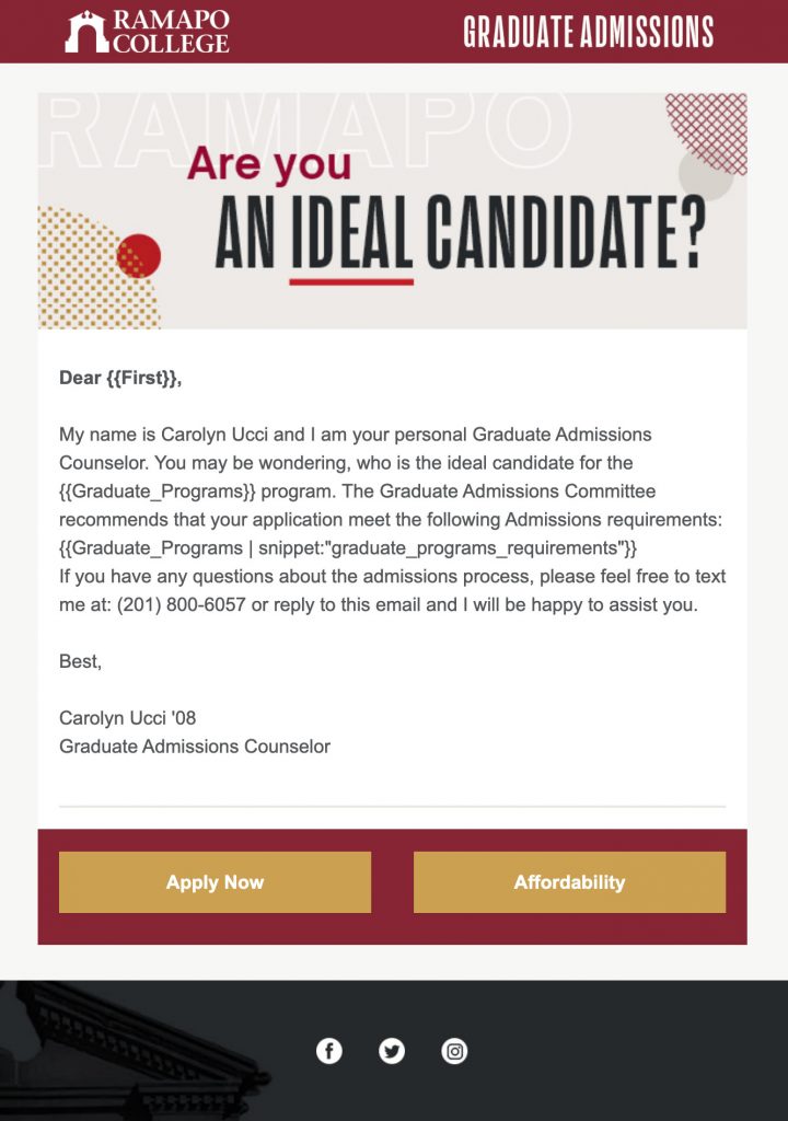
Buttons
Standard content template buttons use a red background (#C41E1E) with a darker red hover (#A42228). Keep button labels concise.
Content Dividers (on website)
Standard content templates use an Arch-themed divider to separate content. Dividers are best used between the end of a paragraph and beginning of a content heading.
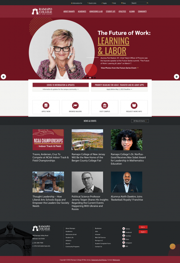
Digital Examples
505 Ramapo Valley Road
Mahwah, NJ 07430
p: 201-684-7500
e: information@ramapo.edu
Copyright ©2026 Ramapo College Of New Jersey | Statements And Policies | Accessibility | Contact Webmaster.